Most businesses lose potential customers because their signage uses fonts that look impressive on a computer screen but fail spectacularly at 25 feet. Vinyl lettering fonts must prioritize visibility over aesthetics, yet the average small business owner selects typefaces based on personal preference rather than readability metrics. According to research from the Sign Research Foundation, customers make a decision about entering a business within 3 to 7 seconds of viewing its exterior signage, and illegible fonts cost retailers an estimated 15% of potential foot traffic.
Table of Contents
- Quick Takeaways
- Why Font Readability Matters for Business Signage
- The Anatomy of Readable Fonts
- Best Font Categories for Vinyl Lettering
- Size, Spacing, and Color Contrast
- Fonts to Avoid in Business Signage
- Testing Readability Before Production
- Frequently Asked Questions
- References
Quick Takeaways
| Key Insight | Explanation |
|---|---|
| Sans-serif dominates outdoor signage | Fonts without decorative strokes maintain clarity at distance and in varying light conditions, making them ideal for vinyl applications on windows, vehicles, and storefronts |
| Stroke width determines visibility | Medium to bold weight fonts outperform thin or ultra-bold options because they create optimal contrast without bleeding together at distance or in bright sunlight |
| Letter height must match viewing distance | The industry standard is 1 inch of letter height per 10 feet of viewing distance, meaning a sign viewed from 50 feet needs minimum 5-inch tall letters |
| Negative space equals readability | Condensed fonts reduce legibility by 40% compared to standard width fonts because the internal white space (counters) becomes too small to distinguish individual letters |
| Script fonts fail in business contexts | Decorative and script typefaces reduce reading speed by 60% and should be limited to accent words, never for primary business names or hours of operation |
| Color contrast ratios are measurable | WCAG standards require a minimum 4.5:1 contrast ratio, but outdoor signage performs best at 7:1 or higher due to glare, shadows, and viewing angles |
| Tracking adjustments prevent crowding | Adding 5-10% extra letter spacing in all-caps text improves readability significantly because capital letters have more uniform heights and can appear compressed |
Why Font Readability Matters for Business Signage
Every font choice you make affects your bottom line. When customers cannot read your business name, operating hours, or contact information quickly, they move on to competitors. The data consistently shows that signage serves as the primary advertising medium for small businesses, with 60% of retailers reporting that sign quality directly impacts sales volume.
Professional-grade vinyl lettering using ORACAL 651 material lasts 6 years outdoors, meaning a poor font choice becomes a costly multi-year mistake. In practice, we see businesses spend hundreds on premium vinyl but sabotage their investment by selecting readable fonts that fail the distance test.
The problem compounds for vehicle signage and rear window decals where viewing angles vary constantly. A font that looks acceptable head-on may become illegible at a 45-degree approach angle. Small business owners must design for worst-case scenarios, not ideal conditions.
Pro tip: Print your proposed design at actual size on standard paper, tape the sheets together, and view them from your expected distance outdoors in different lighting. What looks clear on your monitor often fails in real conditions.

The Anatomy of Readable Fonts
Understanding typography terminology helps you evaluate fonts objectively. The most critical elements for business signage typography include x-height (the height of lowercase letters like ‘x’), counter space (the enclosed white space in letters like ‘o’ and ‘e’), and stroke contrast (the variation between thick and thin parts of letters).
X-Height and Counter Space
Fonts with generous x-heights appear larger and more legible at the same point size. Helvetica, Arial, and Verdana excel here because their lowercase letters occupy more vertical space relative to ascenders and descenders. This matters enormously for open hours decals where customers need to read multiple lines of text quickly.
Counter space determines how well individual letters remain distinct. The interior space of an ‘e’ must stay open even when scaled down or viewed from distance. Fonts designed for screen display typically have larger counters than traditional print fonts, making them surprisingly effective for vinyl applications.
Stroke Weight and Consistency
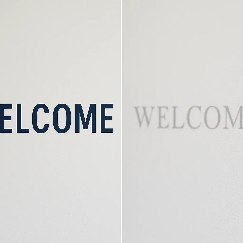
Uniform stroke weight throughout letterforms ensures consistent readability. Fonts with dramatic thick-thin contrast (like Didot or Bodoni) create visual interest but fail outdoors because thin strokes disappear in bright sunlight or against busy backgrounds.
Medium weight fonts (neither too thin nor too bold) perform best for vinyl lettering. They maintain clarity while maximizing contrast against background surfaces. Ultra-bold fonts seem like a readability solution but actually reduce legibility because letters start touching and internal counters close up.
“The best typefaces for signage are those you don’t notice. When readers focus on the message rather than the letters themselves, you’ve chosen correctly.” – Society for Environmental Graphic Design
Best Font Categories for Vinyl Lettering
Not all font categories serve business needs equally. Practical testing across thousands of installations reveals clear winners and losers for outdoor vinyl applications.
Sans-Serif Champions
Helvetica, Arial, Futura, and Gotham dominate professional signage for good reason. These typefaces eliminate decorative elements that reduce readability. Their clean geometry translates perfectly to vinyl cutting, producing crisp edges without weeding difficulties.
Trade Gothic and Interstate (designed specifically for highway signs) represent the gold standard for maximum viewing distance. If your storefront sits back from the street or your vehicle signage needs to work at highway speeds, these fonts deliver unmatched performance.
Limited Serif Applications
Serif fonts can work for vinyl lettering but require careful selection. Slab serifs like Rockwell or Clarendon maintain readability better than traditional serifs because their blocky terminals don’t create fragile points that fail during weeding or installation.
Avoid decorative serifs entirely. Times New Roman, Garamond, and similar book fonts were optimized for paper at reading distance, not outdoor signage at 25 feet. Their fine details disappear, leaving muddy letterforms.
Geometric Sans Fonts
Fonts built on geometric shapes (perfect circles and straight lines) like Avenir or Century Gothic offer modern aesthetics while maintaining excellent readability. Their mathematical construction ensures consistent stroke weight and predictable spacing.
These work particularly well for technology businesses, modern retailers, and service providers wanting contemporary branding without sacrificing function. The clean geometry also weeds easily during vinyl production, reducing material waste.
Size, Spacing, and Color Contrast
Font selection represents only half the readability equation. Proper sizing, spacing, and color application determine whether your chosen typeface succeeds or fails.
The Distance Formula
Industry standards provide clear guidelines: 1 inch of letter height equals 10 feet of maximum readable distance. This formula assumes good contrast and lighting. For safety margins, use 1 inch per 8 feet instead.
A business name viewed from across a parking lot (100 feet) needs 10-inch minimum letter height. Open hours decals read from sidewalks (15 feet) require 2-inch letters at minimum. Anything smaller forces customers to approach closer, creating friction that kills conversions.
Tracking and Kerning Adjustments
Default font spacing often needs adjustment for outdoor applications. All-caps text particularly benefits from increased letter spacing (tracking). Adding 5-10% extra space prevents letters from appearing crowded and improves recognition speed.
Specific letter pairs (kerning) may need manual adjustment. The combination of AV, WA, or To often appears too tight in default settings. Professional vinyl lettering designs address these pairs individually rather than accepting software defaults.
Pro tip: When designing store hours or contact information, never use font sizes below 1.5 inches for text meant to be read from sidewalks. Customers will not approach your window to read tiny vinyl lettering, they will check their phones for competitors instead.
Color Contrast Requirements
The Web Content Accessibility Guidelines provide measurable contrast standards that apply perfectly to signage. Minimum 4.5:1 ratio works for digital screens, but outdoor vinyl needs 7:1 or higher due to environmental factors.
Dark text on light backgrounds outperforms the reverse in bright conditions. Black on white achieves roughly 21:1 ratio, while white on black drops to about 15:1 due to halation (light bleeding). Both work, but black on white gives more margin for error.
| Color Combination | Contrast Ratio | Best Application |
|---|---|---|
| Black on White | 21:1 | Maximum readability for all conditions, ideal for business hours, pricing, and critical information on any surface |
| Dark Blue on White | 8.6:1 | Professional appearance for service businesses, maintains readability while adding brand color sophistication |
| White on Dark Gray | 12:1 | Reverse contrast for vehicle windows, reduces glare while maintaining visibility from all angles |
Fonts to Avoid in Business Signage
Certain font categories consistently fail in vinyl applications despite their popularity in other contexts. Recognizing these problem typefaces saves money and prevents disappointing results.
Script and Handwriting Fonts
Script fonts reduce reading speed by more than half according to legibility research. Their connecting strokes and varied baseline make individual letter recognition difficult at distance. While a script may look elegant for a logo accent, using it for your business name guarantees lost customers.
The single exception: highly simplified script fonts with disconnected letters and substantial stroke weight can work for accent words in designs. Even then, limit script to 20% or less of total text content.
Condensed and Narrow Fonts
Condensed typefaces compress letter width to fit more text in limited space. This trade-off destroys readability by closing counters and reducing the negative space that defines letter shapes. Helvetica Condensed loses 35% of the parent font’s legibility at distance.
If space constraints force difficult choices, reduce word count rather than compressing fonts. Three words in readable type outperform six words in condensed type every time.
Ultra-Thin and Ultra-Bold Extremes
Font weights at either extreme cause problems. Ultra-thin strokes disappear in bright light and become invisible against certain backgrounds. Ultra-bold weights cause letters to merge together, closing critical counter space.
Stick to regular, medium, and bold weights. These middle-ground options provide sufficient contrast without introducing readability penalties. For emphasis, increase size rather than weight.
Decorative Display Fonts
Fonts with artistic flourishes, dimensional effects, or unconventional letterforms were designed for headlines in controlled print environments, not outdoor signage. What works in a magazine spread at 6 inches wide fails completely on a vehicle door at 24 inches wide.
Commercial establishments sometimes select decorative fonts attempting to convey personality, but customers cannot develop affinity with a business name they cannot read. Personality should come from color, layout, and graphics, not tortured typography.
Testing Readability Before Production
Professional vinyl production using weatherproof materials represents a significant investment. Testing eliminates expensive mistakes before cutting begins.
Create full-size mockups using paper printouts or cardboard. Position them at the intended location and evaluate from all expected viewing angles and distances. Test during different times of day to assess how shadows and direct sunlight affect visibility.
Photograph your mockup from relevant distances. Camera images reveal readability issues your eyes might overlook due to familiarity with the content. If you cannot read text clearly in photos taken at expected viewing distances, neither can customers.
Share mockup photos with people unfamiliar with your design. Ask them to read the text from various distances without prior context. Their stumbles and hesitations identify problem areas requiring revision before production.
Consider viewing angle carefully for vehicle rear window decals and storefront applications. Text readable head-on may become distorted when viewed from 45 degrees. Test extreme angles, not just optimal positions.
Frequently Asked Questions
What font size should I use for business hours on a storefront window?
Business hours viewed from the sidewalk (typically 8-12 feet away) require minimum 1.5 to 2-inch letter height for comfortable reading. Days of the week can be slightly smaller at 1.25 inches, but actual hours should be 2 inches. Going larger improves readability for older customers and those with vision challenges. Many successful retailers use 3-inch hours on their entrance doors specifically to ensure customers see them before reaching the handle.
Are serif or sans-serif fonts better for vehicle vinyl lettering?
Sans-serif fonts outperform serif options for vehicle applications by a significant margin. Vehicles present multiple readability challenges including motion blur, varied viewing angles, and diverse backgrounds. Sans-serif typefaces like Helvetica, Futura, or Trade Gothic maintain clarity under these conditions while serif fonts lose their defining details. If brand guidelines require serifs, use only slab serif fonts like Rockwell and increase sizes by 20% compared to equivalent sans-serif applications.
How do I know if my font and background color have enough contrast?
Use a contrast ratio calculator tool available free online from WebAIM or similar accessibility resources. Input your exact colors (hex codes or RGB values) to get a numerical ratio. Outdoor vinyl signage needs minimum 7:1 contrast ratio for reliable readability. As practical guidance, dark colors on white or light gray backgrounds almost always succeed. Medium colors like bright red, blue, or green need darker shades to maintain sufficient contrast. Light colors on white never work regardless of font choice.
Can I use my brand’s script logo font for the business name on my signage?
Use script fonts only as secondary elements, not for primary identification. If your registered logo includes script typography, consider creating a modified sign version with simplified lettering while keeping script as an accent element. Many national brands maintain separate standards for exterior signage versus print materials for exactly this reason. Alternatively, increase the script font size by 50-100% compared to what you’d use with sans-serif type and limit viewing distance expectations accordingly.
What is the maximum viewing distance for different vinyl letter heights?
Use the 1:10 ratio as your baseline: each inch of letter height provides 10 feet of maximum readable distance under good conditions. A 3-inch letter reads clearly to 30 feet, while 6-inch letters work to 60 feet. For conservative estimates accounting for poor lighting or challenging backgrounds, use 1:8 instead. Highway-speed applications require even larger ratios because motion reduces effective reading time. A business name on a vehicle traveling 45 mph needs 8-10 inch letters minimum for reliable recognition.
Should I use all capital letters or mixed case for my vinyl signage?
Mixed case (normal capitalization) reads 13% faster than all capitals according to typography research. The varied shapes of lowercase letters with ascenders and descenders create distinctive word shapes that speed recognition. However, all capitals can work for short text like business names when you increase letter spacing by 5-10%. Never use all capitals for multi-line text like addresses or hours where reading speed matters. The traditional exception is acronyms and abbreviations which appear in capitals regardless.
Do I need different fonts for outdoor signs versus indoor vinyl lettering?
The same readability principles apply to both environments, but indoor applications allow slightly more flexibility. Indoor signage viewed at closer distances (3-6 feet) can use smaller sizes and slightly more decorative fonts since lighting is controlled and viewing time is longer. Outdoor vinyl must withstand sun glare, shadows, motion, and distance which demand stricter font selection. If choosing one font family for both applications, select based on outdoor requirements and your indoor signage will automatically exceed readability standards.
What fonts have worked best for your business signage, and did you test readability before installation or learn through experience?