Picking the wrong color for your business hours window decal is not a minor aesthetic mistake. It is a communication failure. Customers who cannot read your hours from the sidewalk will assume the business is closed, skip the door, and not come back. Research from the Outdoor Advertising Association of America has long confirmed that contrast and legibility at distance are the primary drivers of whether signage gets read at all. If you are ordering a vinyl decal color without a plan, you are guessing with money. This guide covers exactly how to match vinyl decal color options to your storefront, your brand, and your real-world visibility conditions.
Table of Contents
- Why Color Contrast Determines Readability
- Understanding ORACAL 651 Vinyl Color Options
- Matching Colors to Your Storefront Glass
- Brand Consistency vs. Legibility Tradeoffs
- Color Comparison Table: Top Combinations for Business Hours Decals
- Common Mistakes in Storefront Decal Color Selection
- Custom Vinyl Lettering Colors and Special Finishes
- Frequently Asked Questions
- References
Why Color Contrast Determines Readability

The single most important variable in choosing a vinyl decal color for your business hours sign is not aesthetics. It is contrast ratio. The Web Content Accessibility Guidelines (WCAG) recommend a minimum contrast ratio of 4.5:1 for normal text against its background. While those guidelines are written for screens, the underlying visual science applies directly to window signage viewed from a distance of five to thirty feet under variable lighting.
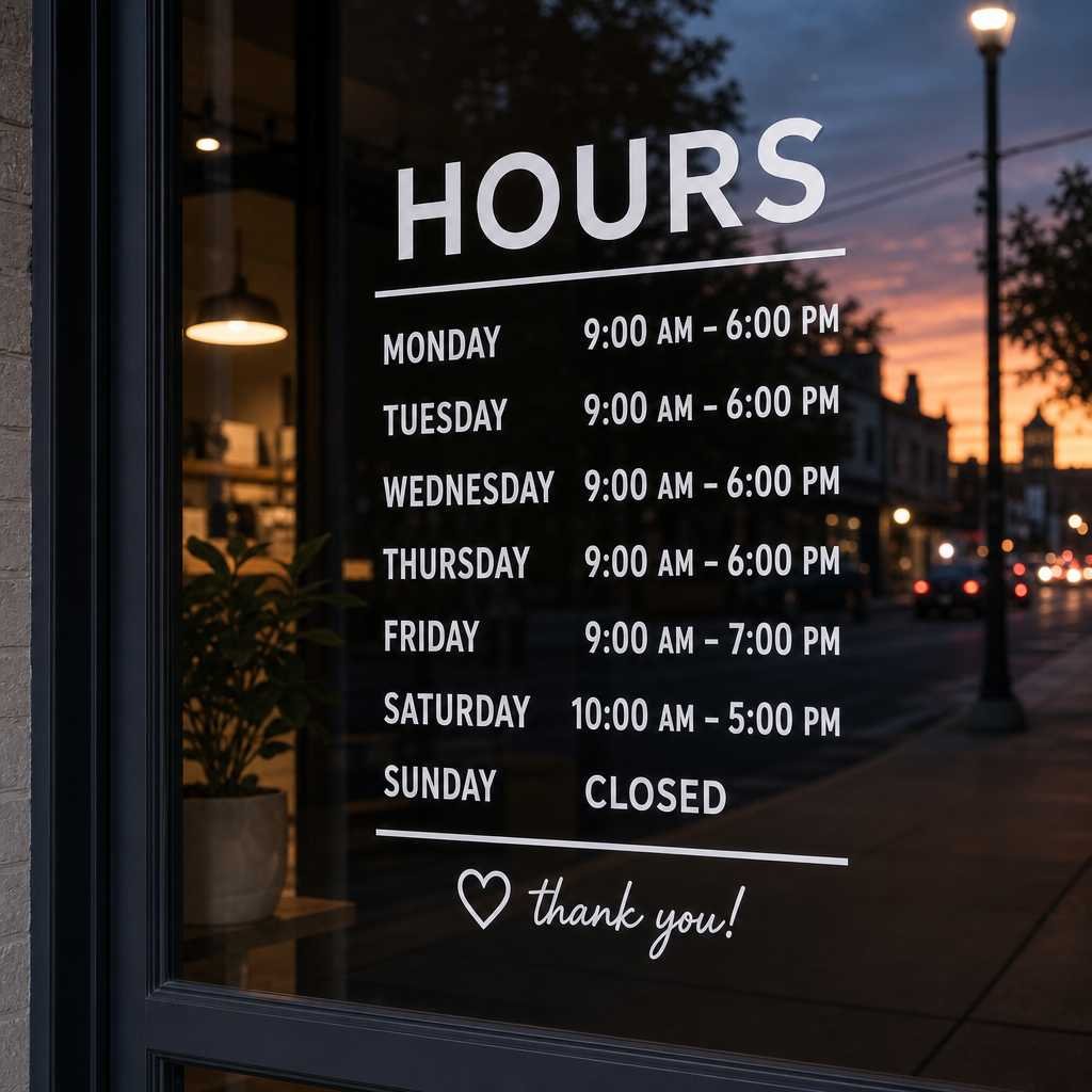
In practice, a white decal on clear glass fails every time. Clear glass transmits the visual noise of your store interior, which destroys contrast. A dark-tinted glass storefront, on the other hand, becomes an excellent background for white, yellow, or gold vinyl lettering. The color you choose is only half the equation. What sits behind it matters equally.
Direct sunlight is the other factor most business owners underestimate. Morning sun hitting east-facing storefronts at a low angle will wash out pale colors like light gray, cream, or pastel vinyl entirely. If your entrance faces east or west, lean toward high-saturation dark colors such as black, navy, or deep red, or go with a white or bright yellow decal that punches through glare rather than dissolving into it.
Understanding ORACAL 651 Vinyl Color Options
Not all vinyl is made equal, and the color range available depends entirely on the material a supplier uses. ORACAL 651, the professional-grade vinyl used by The Retractable Banner Shop for their open hours decals, is available in over 80 standard colors. That range includes matte and gloss finishes, metallic and chrome options, translucent colors, and high-contrast solids.
ORACAL 651 is rated for outdoor use for up to six years and carries UV resistance built into the ink layers, not applied as a coating. That distinction matters enormously for storefront decals that receive direct sun exposure. A cheaper vinyl may look identical on day one but will fade, crack, or shrink within eighteen months, which means your business hours become partially illegible without you noticing it.
Gloss vs. Matte Finish and How It Changes Color Perception
Gloss finishes increase perceived color saturation and improve readability in low-light conditions such as early mornings or overcast days. Matte finishes reduce glare, which is an advantage on south-facing storefronts that receive sustained direct sunlight. A matte black decal on a lightly tinted window is often the most readable combination in harsh afternoon sun.
Metallic finishes, including silver chrome and gold, are visually striking but should only be used when the surrounding glass is dark enough to frame them. On clear glass, metallic vinyl produces significant glare and actually reduces legibility rather than improving it.
Matching Colors to Your Storefront Glass
Storefront glass comes in four common variants: clear, lightly tinted (bronze or gray), heavily tinted (dark bronze or reflective), and frosted. Each one demands a different approach to custom vinyl lettering colors.
Clear Glass
Clear glass is the most challenging background. The interior of your store, including shelving, products, and lighting, creates a complex visual backdrop that competes with your decal. The best solutions are opaque dark vinyl on a white or light-colored backing element, or using a two-color decal design where an outline or drop shadow creates separation between the lettering and whatever sits behind it. White lettering with a solid black outline, for example, works reliably on clear glass regardless of interior layout.
Tinted and Reflective Glass
Tinted glass is a gift for decal design. Light-colored vinyl, particularly white, bright yellow, or gold, reads with exceptional clarity against a dark tinted background. Reflective glass, common in office buildings and retail strips built after the 1990s, behaves like a mirror on the outside. White vinyl is almost mandatory here, as it is the only color that holds contrast against the reflected sky and street.
Frosted Glass
Frosted or sandblasted glass panels are increasingly popular for boutiques and professional service offices. Frosted backgrounds pair best with solid dark colors, navy, black, or forest green, because they offer a light diffused background that washes out light-colored vinyl.
Pro tip: Before ordering, take a photo of your storefront glass at midday with the sun behind you. Print it at scale, hold up a white sheet of paper and a black sheet against the glass in that photo, and compare which one you can read faster. That tells you instantly which direction your color choice should go.
Brand Consistency vs. Legibility Tradeoffs
Many business owners approach storefront decal design as a branding exercise. They specify their exact brand colors from their logo and expect the decal to match. That instinct is understandable but often produces signage that is visually cohesive and functionally unreadable.
The practical rule is this: brand colors belong in supporting design elements, not in the primary text of your hours. If your brand color is a medium-toned teal, use it for a border, a logo mark, or an accent line. Use high-contrast black or white for the actual hour listings. A customer who cannot read your hours does not care how accurately your decal matches your brand guidelines.
“Signage legibility drops sharply when the contrast ratio between text and background falls below 3:1. At that threshold, a significant portion of your potential customers, particularly those over 50, cannot reliably read the sign from a normal approach distance.” Source: Illuminating Engineering Society, Lighting Handbook.
The data consistently shows that storefronts with clearly legible operating hours experience fewer “is this place open?” hesitations from foot traffic. That matters because a customer who pauses at your door but cannot confirm you are open has a high probability of walking on rather than entering to check.
Color Comparison Table: Top Combinations for Business Hours Decals
The following table compares three proven color strategies for business hours window decals across the variables that matter most for a commercial storefront setting.
| Color Strategy | Best Suited For | Key Advantage / Limitation |
|---|---|---|
| White vinyl on tinted or dark glass | Tinted bronze or gray glass, reflective glass storefronts | Highest contrast in most lighting conditions. Limitation: blends into clear glass or white interior walls. |
| Black vinyl on clear or frosted glass | Clear glass storefronts, frosted panels, light-colored window frames | Excellent daytime readability. Limitation: hard to read at night without interior backlighting. |
| Gold or yellow vinyl on dark glass | Dark tinted glass, upscale retail, professional service offices | Premium appearance, strong contrast on dark backgrounds. Limitation: poor readability on clear or lightly tinted glass. |
Common Mistakes in Storefront Decal Color Selection
A common mistake is ordering a color that looks great on a screen but fails in the field. Monitor colors are backlit and highly saturated. Vinyl colors reflect ambient light. A vivid coral that pops on your laptop screen may look like a washed-out salmon on your south-facing window at noon.
Another common error is choosing a single color for both the text and any background or border element, creating a monotone decal with no visual hierarchy. Your business name, the word “HOURS,” and the actual time listings should each have a distinct visual weight. Using two colors, one for headings and one for data, solves this cleanly without adding visual clutter.
The third mistake is ignoring night visibility entirely. If your business has evening hours or is located in a high foot-traffic area after dark, a reflective or metallic vinyl can dramatically increase how readable your decal is when illuminated by streetlights or car headlights. Standard matte black vinyl, while excellent in daylight, essentially disappears after sunset unless your interior lighting hits the window directly.

Pro tip: Order a sample swatch of your chosen vinyl color from your supplier before committing to a full decal order. Tape it to your actual window glass and photograph it at three times of day, morning, noon, and evening. If it reads clearly in all three, you have the right color.
Custom Vinyl Lettering Colors and Special Finishes
Beyond solid colors, ORACAL 651 offers several specialty finishes that are genuinely useful for storefront decal design rather than just decorative. Understanding what each finish actually does under real conditions prevents expensive ordering mistakes.
Translucent Vinyl
Translucent vinyl allows light to pass through it, which means the color shifts depending on lighting direction and intensity. Applied to a lit window, translucent vinyl can produce an illuminated effect from inside-out that looks premium. Applied to an unlit or deeply tinted window, it reads as muddy and indistinct. Use it only if your storefront has strong interior lighting positioned to backlight the window.
Chrome and Metallic Vinyl
Chrome vinyl is polarizing, both visually and in terms of functional performance. It reflects whatever is in front of it, which creates a striking mirror effect on large design elements but makes small lettering nearly illegible at an angle. For business hours text specifically, chrome vinyl should only be used for secondary elements such as borders or logo accents, not for the hour listings themselves.
Matte Black as the Default Safe Choice
If you are genuinely uncertain and need a color that performs acceptably across most storefront types, matte black is the reliable default for dark lettering. It reads well on frosted glass, clear glass with a light interior, and any glass with a white or light-colored frame. It looks professional without being loud, and it does not fade visibly over the six-year lifespan of ORACAL 651.
The Retractable Banner Shop’s open hours decals allow full color customization, which means you are not limited to stock combinations. Bringing a specific Pantone or hex color reference to your order ensures the vinyl color you receive matches your brand standards as closely as the ORACAL 651 color library allows.
Frequently Asked Questions
What is the best vinyl color for a business hours decal on clear glass?
Black or dark navy vinyl is the most reliable choice for clear glass storefronts. Clear glass provides no consistent background color, so you need a dark, high-contrast color that holds its own against visual noise from the store interior. White vinyl with a dark outline is the second-best option if you want lighter lettering.
Will the vinyl color fade in direct sunlight?
Professional-grade ORACAL 651 vinyl is UV resistant and rated for approximately six years of outdoor exposure. However, some colors are more light-stable than others. Dark solid colors such as black, dark blue, and forest green hold their appearance longest. Bright reds and purples have slightly faster fade rates under sustained UV exposure. Cheap vinyl from non-professional suppliers often fails within eighteen months regardless of color.
Can I use my exact brand colors for my business hours decal?
You can, but you should evaluate whether your brand color provides sufficient contrast against your specific window glass before ordering. Medium-toned brand colors, those that are neither very light nor very dark, frequently perform poorly as primary text colors on window decals. A better approach is to use your brand color for borders or accent elements while keeping the actual hour listings in high-contrast black or white.
What is the difference between gloss and matte vinyl for storefront use?
Gloss vinyl produces richer, more saturated color and performs better in overcast or low-light conditions. Matte vinyl reduces glare, which is valuable on south or west-facing storefronts that receive prolonged direct sunlight. In most cases, the choice between gloss and matte has a smaller impact on readability than the actual color contrast ratio between the vinyl and its background.
How many colors should I use on a business hours window decal?
Two colors are almost always sufficient and usually optimal. Use one color for your primary text, which should be your highest-contrast choice, and one color for secondary elements such as a border, the word “HOURS,” or a logo mark. Adding a third color is acceptable if one is used exclusively for a background block behind the text. More than three colors on a business hours decal creates visual clutter and slows down the reading process, which is exactly the opposite of what functional signage is supposed to do.
Does the color of the vinyl affect how the decal is applied to the window?
The application process is the same regardless of vinyl color. However, lighter translucent colors can make air bubbles and alignment errors more visible once applied, because you are seeing through the vinyl to the surface beneath. Opaque colors are more forgiving of minor installation imperfections. If you are applying the decal yourself for the first time, start with an opaque color for easier, cleaner results.
What color combination have you found works best on your storefront glass? Share your experience so other business owners can learn from what actually works in the field.
References
- Statista, market data and consumer behavior statistics relevant to retail signage and in-store communication
- Forbes, small business marketing and storefront presentation insights for independent retailers
- HubSpot Marketing Statistics, data on visual communication, first impressions, and customer decision-making
- U.S. Small Business Administration, guidance on physical retail presence, signage standards, and customer accessibility
- Moz, principles of visual clarity and communication applied to business identity and brand presentation