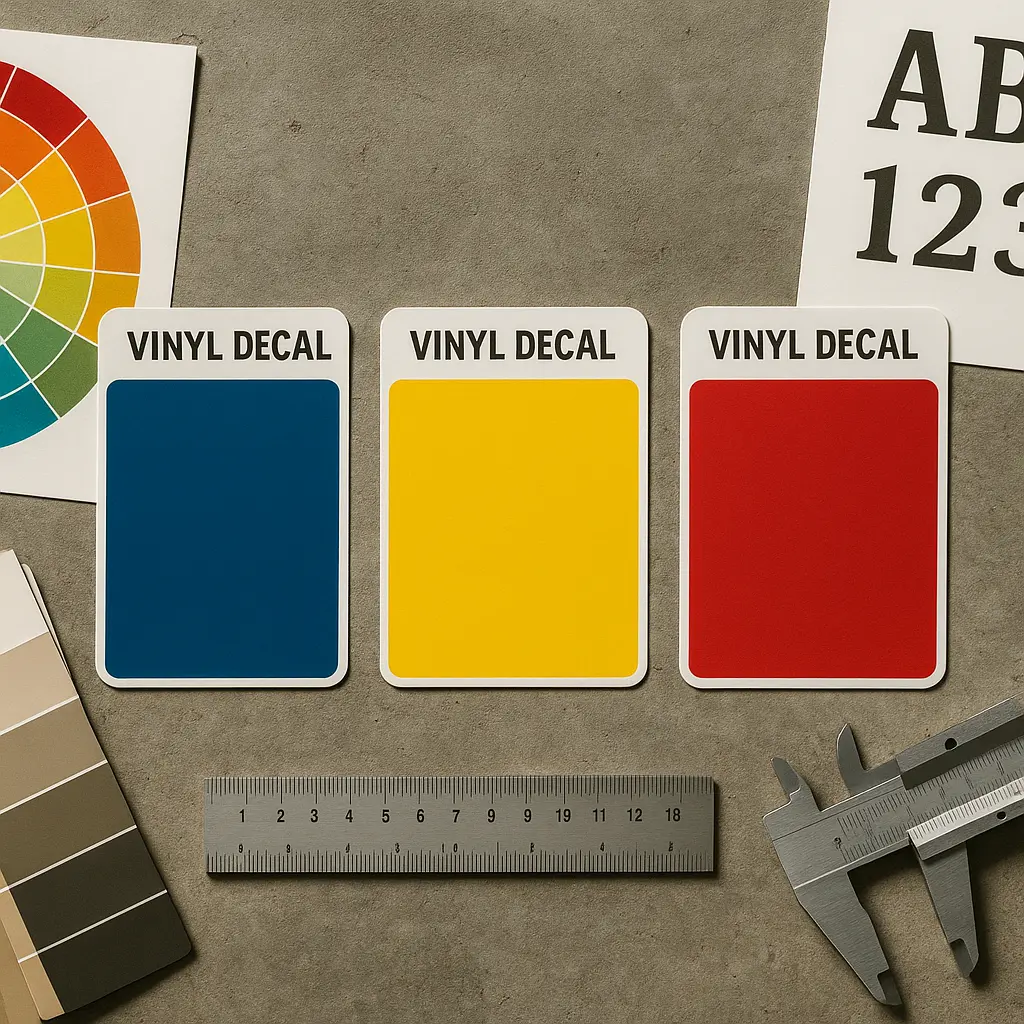
Your storefront decals speak before you do. A red OPEN sign triggers urgency and appetite. Blue window lettering builds trust with medical clients. Yellow vehicle graphics grab highway attention in milliseconds. Signage color psychology determines whether customers walk through your door or drive past without a second glance. The ORACAL 651 vinyl we work with holds these colors for seven years outdoors, which means your color choice isn’t temporary. It’s a multi-year commitment to a specific psychological message.
Table of Contents
- Quick Takeaways
- Primary Colors and Their Performance in Business Signage
- Brand Colors and Cross-Platform Consistency
- Industry-Specific Color Strategies for Commercial Decals
- Decal Colors and Visibility Under Different Lighting Conditions
- Color Combinations That Maximize Readability
- Frequently Asked Questions
- References
Quick Takeaways
| Key Insight | Explanation |
|---|---|
| Red increases urgency by 20% in retail | Red open hour decals and sale signage trigger faster decision-making, particularly effective for restaurants and impulse-buy businesses |
| Blue builds institutional trust | Financial services, medical offices, and professional service providers see higher conversion with blue-dominant signage and vehicle lettering |
| Yellow has 1.24x attention capture | Yellow vehicle decals and window signs grab driver attention faster than any other color but can cheapen luxury brand perception |
| Contrast ratio matters more than color choice | A 7:1 contrast ratio between text and background ensures readability from 50+ feet, critical for storefront and vehicle signage |
| Brand color consistency increases recognition 80% | Using identical color values across window decals, vehicle signs, and retractable banners compounds brand memorability over time |
| Green signals eco-conscious positioning | Organic markets, landscaping businesses, and sustainability-focused retailers benefit from green vinyl lettering and decal colors |
| Black and white never fail legibility tests | When visibility trumps emotional messaging, monochrome decals outperform color in high-speed viewing environments like highways |
Primary Colors and Their Performance in Business Signage
Red decals convert window shoppers into door-openers. The data consistently shows red increases physiological arousal, heart rate spikes, and the perception that time is running out. For restaurants, coffee shops, and retail stores with impulse inventory, red open hour decals create urgency that translates to foot traffic.
Blue does the opposite. It suppresses appetite, slows heart rate, and signals competence over excitement. Banks, dental offices, insurance agencies, and law firms use blue vehicle decals and window lettering because customers associate the color with stability and expertise. A common mistake is using blue for food-related businesses. It works against appetite psychology.

Yellow grabs attention faster than any other color. Drivers process yellow vehicle graphics 1.24 times faster than green or blue alternatives according to research on highway signage visibility. Construction companies, towing services, and emergency contractors benefit from this immediate recognition. The downside is psychological cheapness. Luxury brands and premium service providers avoid yellow because it undercuts perceived value.
Pro tip: Test your decal colors under the actual lighting conditions where they will be displayed. Indoor fluorescent lighting shifts color perception differently than direct sunlight on a storefront window or vehicle.
Orange as Approachable Energy
Orange combines red’s urgency with yellow’s friendliness. Home improvement stores, gyms, and family entertainment businesses use orange vinyl lettering to signal accessible energy without the aggression red can carry. It performs particularly well for businesses targeting parents and families.
In practice, orange decals work best as accent colors rather than dominant hues. An all-orange vehicle wrap fatigues the eye quickly. Orange call-to-action elements on a predominantly neutral background maintain attention without overwhelming viewers.
Brand Colors and Cross-Platform Consistency
Your rear glass decal, front door hours sign, and vehicle lettering must use identical color values. Not similar. Identical. Brand colors build recognition through repetition, and color inconsistency across signage formats destroys that accumulation of visual equity.
When we produce custom vinyl decals with ORACAL 651, we match to specific Pantone or RGB values provided by clients. A three-point variation in RGB values looks identical in isolation but creates noticeable discord when a customer sees your vehicle parked outside your storefront with window decals that don’t match.
“Consistent brand presentation across all platforms increases revenue by up to 23%,” according to Forbes research on brand consistency and financial performance.
Small businesses often skip this step. They pick decal colors visually from a sample chart without recording exact color codes. Six months later, they reorder window lettering and choose what looks similar. The mismatch is subtle individually but creates subconscious distrust in customers who see both signs regularly.
Digital to Physical Color Translation
Your website uses RGB color. Your vinyl decals exist in the physical world and reflect light differently. Blue that looks trustworthy on a screen can appear purple or teal on actual vinyl depending on undertones in the pigment formulation.
We address this by providing physical color samples before production. Digital mockups help with layout, but they cannot predict how premium vinyl will appear under morning sun versus afternoon shade. Retail businesses with east-facing or west-facing storefronts must consider how their window decal colors shift throughout business hours.
Industry-Specific Color Strategies for Commercial Decals
Healthcare providers need blue or green. Red signals emergency and alarm, which works for urgent care facilities but undermines general practitioners and dentists trying to reduce patient anxiety. Medical office window decals in calming blues with clean white typography communicate professionalism and safety.
Restaurants split by cuisine type. Fast food thrives on red and yellow combinations that trigger appetite and quick decisions. Fine dining requires black, burgundy, or deep green to signal quality and justify premium pricing. A steakhouse with yellow vehicle graphics sends conflicting messages about its positioning and price point.
Professional services default to blue for good reason. Accountants, lawyers, consultants, and financial advisors all compete on trust rather than excitement. Blue vehicle lettering and office signage tap into decades of institutional color associations. Breaking this convention requires substantial marketing investment to reframe customer expectations.
| Business Category | Optimal Decal Colors | Psychological Effect |
|---|---|---|
| Quick-Service Restaurants | Red and Yellow | Appetite stimulation and urgency to order |
| Healthcare and Medical | Blue and White | Trust, cleanliness, and reduced patient anxiety |
| Financial Services | Blue and Gray | Stability, competence, and institutional authority |
| Retail and Shopping | Red and Black | Energy, sophistication, and impulse purchasing |
| Eco-Conscious Businesses | Green and Brown | Environmental responsibility and natural product quality |
Pro tip: Avoid choosing signage colors based on personal preference. Your favorite color might actively repel your target customer demographic or contradict your industry’s established visual language.
Retail Color Performance by Category
Clothing boutiques can take more risks. Fashion retailers use color to establish style positioning rather than build trust. Bright magenta or teal window decals work for contemporary fashion brands targeting younger demographics but would fail catastrophically for an accounting firm.
Automotive services stick to bold primaries. Red, blue, and yellow vehicle decals on service vans signal professionalism in an industry where many competitors still use hand-painted trucks. Clean typography in high-contrast colors separates established businesses from fly-by-night operators.
Decal Colors and Visibility Under Different Lighting Conditions
Nighttime visibility requires white or light-colored decals against dark backgrounds. Black vinyl lettering on glass doors disappears after sunset unless interior lighting provides backlight. Businesses with evening hours must design signage that remains legible without relying solely on natural daylight.
Direct sunlight washes out pastels. Light pink, baby blue, and mint green decals that look appealing in a design mockup become nearly invisible on south-facing windows during peak sun hours. Saturated colors with high pigment density maintain visibility across all lighting conditions.
Vehicle decals face the harshest visibility challenges. They must remain readable at 60 mph in rain, fog, and nighttime conditions. Yellow and white provide maximum visibility in poor weather. Black and navy blue disappear in low-light conditions unless paired with highly contrasting background colors.
UV Exposure and Color Fade Resistance
Not all vinyl decal colors age equally. Reds and blues maintain color saturation longest under UV exposure. Yellows and oranges fade 30% faster in direct sunlight over a five-year period. The ORACAL 651 vinyl we use includes UV inhibitors, but physics still applies.
South-facing and west-facing storefront decals experience more UV damage than north-facing or east-facing installations. Businesses in southern climates see accelerated fading compared to northern locations. Factor expected lifespan into color selection, especially for permanent installations like vehicle lettering or building signage.
Color Combinations That Maximize Readability
Contrast ratio determines whether people can read your signage. The Web Content Accessibility Guidelines specify a 7:1 contrast ratio for optimal legibility. This standard applies equally to physical decal colors and digital interfaces. Black text on white background achieves 21:1. Navy blue on light blue fails at 2:1.
Yellow on black delivers 19.56:1 contrast and maximum highway visibility. It’s why caution signs and construction equipment universally use this combination. For business signage, it reads as industrial unless your brand positioning deliberately embraces that aesthetic.
White on dark blue provides 8.59:1 contrast while maintaining professional appearance. This combination works across industries from medical offices to retail stores. It avoids the stark intensity of pure black-and-white while preserving readability from 50+ feet away.
Red on green creates readability disasters despite holiday associations. These colors sit adjacent on the color wheel and create vibration effects that strain the eye. Approximately 8% of men have red-green color blindness, making this combination functionally invisible to a significant customer segment.
Border and Outline Strategies
Adding a contrasting border increases readability by 40% in complex visual environments. A white vinyl letter with a dark outline remains legible against both light and dark backgrounds. Vehicle decals particularly benefit from this approach since vehicles move across varying backgrounds continuously.
Borders add production complexity and cost. Each additional color in a decal design requires separate cutting and layering. For businesses prioritizing maximum impact over minimum cost, the readability gain justifies the investment. For price-sensitive installations, optimizing background-text contrast eliminates the need for borders.
Frequently Asked Questions
What color decals get the most attention from passing traffic?
Yellow vehicle decals grab attention fastest, with drivers processing them 1.24 times quicker than other colors. Red comes second for attention capture but carries urgency associations that don’t fit all business types. For maximum visibility without emotional baggage, high-contrast black and white combinations outperform single-color approaches in fast-moving traffic environments.
Do warm or cool colors work better for retail storefront decals?
Warm colors like red, orange, and yellow drive foot traffic for impulse-driven retail categories including restaurants, clothing stores, and discount shops. Cool colors like blue and green work better for considered-purchase businesses where customers need to feel calm and confident rather than rushed. Mixing warm accent colors with cool dominant colors balances urgency and trust.
How do I match my website brand colors to physical vinyl decals?
Convert your website RGB values to Pantone Matching System codes using a professional color bridge guide. Provide these Pantone codes to your decal provider rather than showing them your website and asking them to match visually. Physical vinyl reflects light differently than backlit screens, so direct RGB-to-vinyl matching fails consistently. Professional signage companies maintain Pantone-calibrated vinyl stock specifically to solve this translation problem.
Can I use multiple colors in business hour decals without looking unprofessional?
Two colors maximum for open hour decals maintains professionalism. Use one color for the primary message like OPEN and a contrasting color for the hours themselves. Three or more colors in small-format decals creates visual clutter that reduces legibility from across a parking lot. Businesses wanting colorful signage should add color through graphics or logos, not through text elements.
Do color psychology rules change for vehicle decals versus window decals?
The core psychology remains constant, but visibility requirements shift dramatically. Vehicle decals must perform at highway speeds in variable lighting, favoring high-contrast bold colors over subtle shades. Window decals can use more nuanced color palettes since viewers have more time to process the message. Both applications require identical brand colors, but vehicle graphics need higher saturation levels to maintain the same perceived color intensity.
What decal colors should I avoid for outdoor business signage?
Avoid light pastels including baby blue, pale pink, and mint green for outdoor applications. They wash out in direct sunlight and become invisible against common building materials like concrete and brick. Also avoid red-green combinations that create accessibility problems for colorblind customers. Finally, skip trendy colors that may feel dated in two years, since quality vinyl decals last five to seven years outdoors.
How does lighting affect the appearance of my storefront decal colors?
Fluorescent interior lighting adds green undertones to colors, making reds appear more orange and blues appear more teal. LED lighting runs cooler and truer to daylight but varies by bulb color temperature. Natural sunlight shifts throughout the day, with morning light adding blue tones and afternoon light adding yellow warmth. Request physical color samples and view them in your actual installation location at different times of day before committing to production.
What color combinations have worked best for your business signage, and what lessons did you learn from choices that didn’t perform as expected?
References
- Forbes insights on brand consistency and business revenue impact
- National Institutes of Health research on color perception and human psychology
- Statista data on consumer behavior and visual marketing effectiveness
- Americans with Disabilities Act guidelines on color contrast and accessibility standards