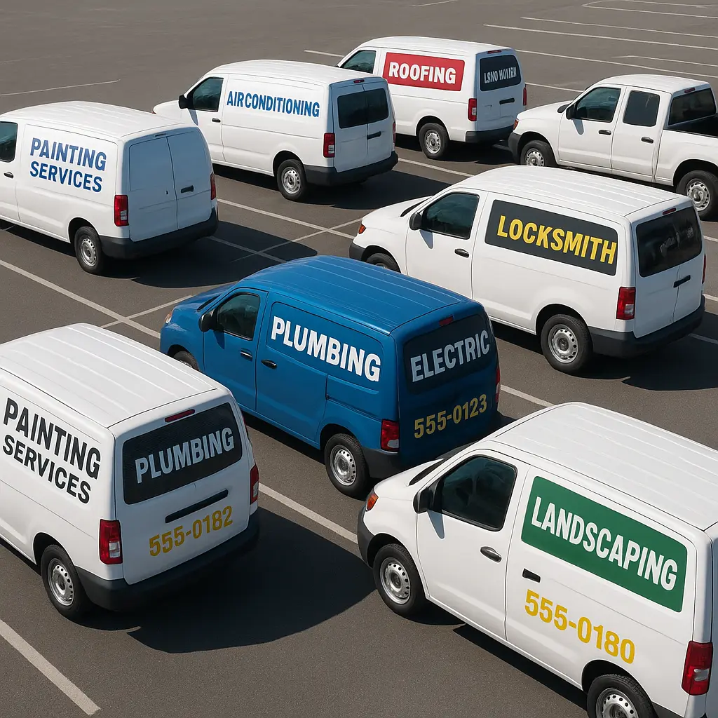
Service vehicle branding lives or dies on rear glass decals. A plumber’s van stuck in traffic becomes a billboard for 40,000 commuters. The data consistently shows that rear glass decals deliver higher impressions per dollar than digital ads for local service businesses, yet most designs fail because owners treat them like oversized business cards. The difference between a decal that generates calls and one that gets ignored comes down to legibility at distance, strategic information hierarchy, and material durability. Professional-grade ORACAL® 651 vinyl outlasts cheap alternatives by years, but the design mistakes happen long before material selection.
Table of Contents
- Quick Takeaways
- Why Rear Glass Placement Demands Different Design Rules
- Typography Hierarchy for Moving Billboards
- Color Contrast Ratios That Actually Work
- Perforated vs. Solid Vinyl for Service Vehicles
- Information Density: What to Include and Exclude
- Installation Considerations for Maximum Lifespan
- Frequently Asked Questions
- References
Quick Takeaways
| Key Insight | Explanation |
|---|---|
| Legibility distance determines font size | Use minimum 3-inch letter height for text readable at 50 feet, 6-inch for primary messaging visible at 100+ feet in traffic |
| Perforated vinyl maintains visibility | 50/50 or 60/40 perforated vinyl allows driver visibility while displaying full-color graphics from outside, essential for legal compliance |
| Contrast ratio must exceed 70% | Light backgrounds with dark text or vice versa. Avoid mid-tone combinations that disappear in varied lighting conditions |
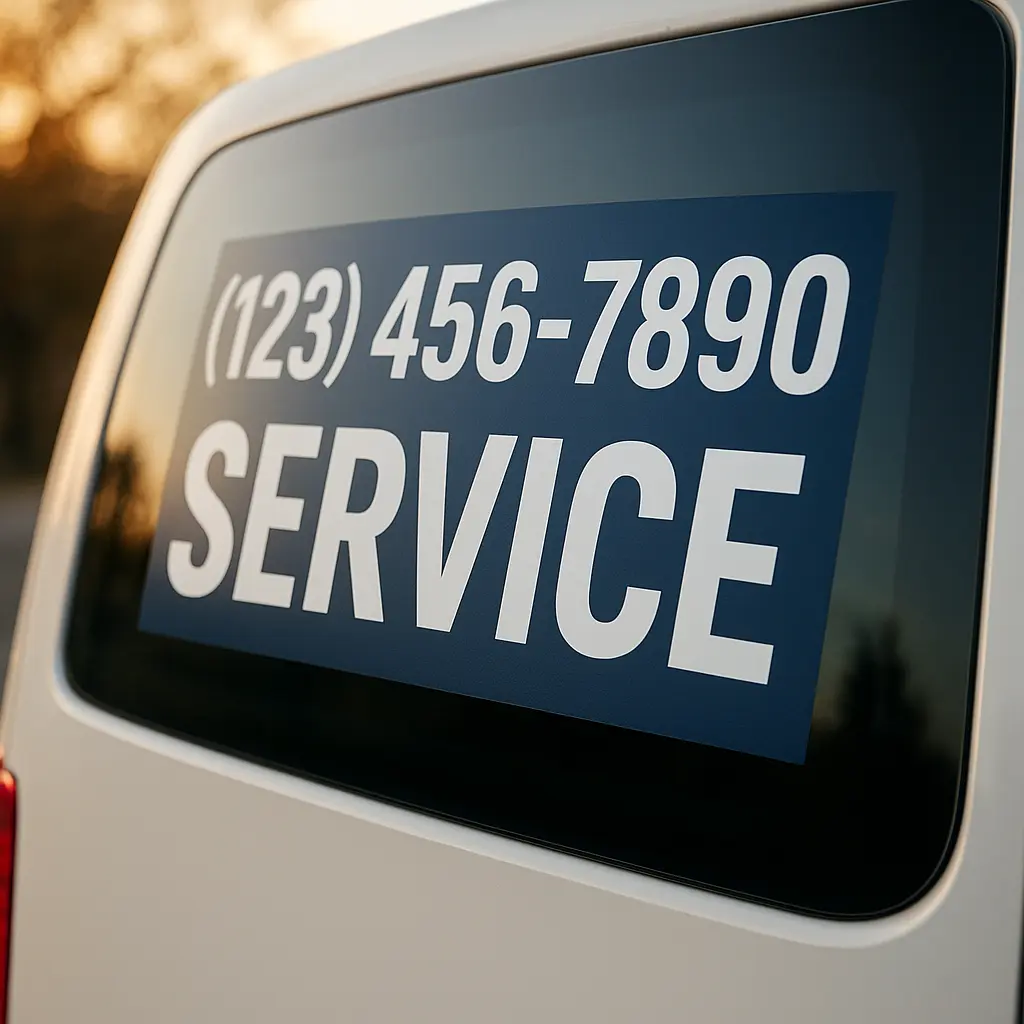
| Limit information to 7 words maximum | Company name, phone number, and one service descriptor. Anything more reduces recall rates by 60% according to outdoor advertising studies |
| UV-resistant laminate extends life 3-5 years | Professional-grade ORACAL® 651 with UV laminate prevents fading and cracking in sun exposure common to service vehicles |
| QR codes fail on moving vehicles | Scan rates drop to near zero on vehicles. Phone numbers deliver 12x better response than QR codes for mobile signage |
| Horizontal layouts outperform vertical | Rear glass is wider than tall. Work with the natural aspect ratio rather than forcing vertical designs that waste space |
Why Rear Glass Placement Demands Different Design Rules
Rear glass decals operate under constraints that side panels and doors do not face. Viewers see your design while both vehicles are moving, often for only 3-7 seconds at stoplights or in traffic. The average viewing distance ranges from 15 to 75 feet, and the angle constantly shifts as vehicles merge or change lanes.
Window curvature creates distortion that flat mockups cannot predict. Text that looks perfectly balanced on a computer screen bows and warps on actual curved glass. A common mistake is designing on flat templates without accounting for the compound curves found on modern cargo vans and SUVs. In practice, this means testing your layout on the actual vehicle or using manufacturer-specific templates that map curvature accurately.
Driver visibility requirements add legal constraints. Most jurisdictions prohibit rear window treatments that obstruct more than a certain percentage of the driver’s view. Perforated vinyl solves this by creating one-way visibility, but the perforation pattern affects how colors and details appear from the outside. Dark colors read better through perforation than pastels, which can look washed out.
Pro tip: Photograph your design mockup on a phone screen, then view it from 50 feet away. If you cannot read the primary message, the font is too small or the contrast insufficient.
Typography Hierarchy for Moving Billboards
Service vehicle branding requires aggressive hierarchy. Your company name should dominate, sized at least twice as large as any secondary information. Phone numbers come next, followed by a single service descriptor if space permits. Everything else is noise that reduces effectiveness.
Font selection matters more than most designers admit. Sans-serif typefaces like Helvetica, Arial, or Gotham maintain legibility at distance and through motion blur. Script fonts and thin serifs fail catastrophically on vehicle signage. The stroke weight needs to be heavy enough to remain visible when backlit by headlights at night or when the vehicle is covered in road grime.
Letter Spacing and Word Count Limits
Tracking should be increased 10-20% beyond normal body copy settings. Letters that touch or sit too close blur together at speed. Each word needs breathing room. The industry standard limits messaging to seven words total because recall rates plummet beyond that threshold. Research from the Outdoor Advertising Association of America confirms that three to five words achieve optimal message retention.
All-caps text reduces readability by 13% compared to sentence case for anything longer than three words. Use caps for company names or single-word callouts, but switch to mixed case for phone numbers or website URLs. The ascending and descending letterforms in mixed case create distinctive word shapes that the brain processes faster.
Color Contrast Ratios That Actually Work
Color choices make or break vehicle signage. A contrast ratio below 70% renders text unreadable in overcast conditions, at dawn, or at dusk. The mathematical formula is simple: (lighter color value minus darker color value) divided by lighter color value. Aim for 80% or higher.
White text on dark blue, black on yellow, white on red, and black on white remain the proven combinations for maximum visibility. Avoid color pairs like red on blue, green on blue, or any combination where both colors have similar luminance values. These fail the squint test, where closing your eyes halfway should still allow you to distinguish figure from ground.
| Color Combination | Contrast Ratio | Best Use Case |
|---|---|---|
| Black text on white background | 95% | Maximum readability, works in all conditions but shows dirt easily |
| White text on dark blue | 87% | Professional appearance, excellent night visibility, hides minor dirt |
| Black text on yellow | 92% | Highest attention-getting, ideal for emergency or construction services |
| Red text on white | 76% | Acceptable but lower performance, use larger font sizes to compensate |
Metallic and gradient finishes reduce contrast and readability. What looks dynamic in a design portfolio becomes muddy at 60 mph. Flat colors with clean edges outperform decorative treatments every time. If brand guidelines require gradients, restrict them to background elements and keep all text on solid fields.
The 3M Commercial Graphics Division states that increasing contrast by just 20% can improve message recall by up to 38% in mobile advertising applications.
Perforated vs. Solid Vinyl for Service Vehicles
Perforated window film uses tiny holes that create one-way visibility. From inside the vehicle, the driver sees through clearly. From outside, the solid vinyl surface displays your full-color graphics. The perforation ratio (typically 50/50 or 60/40) refers to the percentage of solid vinyl versus open holes.
A 50/50 ratio provides better interior visibility but reduces the vibrancy of outside graphics by allowing more light through. A 60/40 ratio delivers richer exterior colors and better opacity but slightly reduces driver visibility. For service vehicles where drivers spend significant time on the road, 50/50 offers the better balance. For vehicles primarily parked at job sites, 60/40 maximizes advertising impact.
Service vehicle branding with solid vinyl is only legal if applied to rear windows that are not required for driver visibility, such as cargo van rear doors with no window or rear quarter panels. Most states require functional rear visibility through mirrors or direct line of sight, making perforated vinyl the only compliant choice for rear glass on vans, SUVs, and trucks with rear seats.
Perforated vinyl requires different installation techniques than solid. The adhesive layer must be applied with more pressure to ensure each tiny solid section bonds properly. Air release channels matter less because the perforation naturally prevents air bubbles, but dirt contamination during installation shows more on perforated material. Professional installation pays for itself in longevity.
Pro tip: Order samples of both 50/50 and 60/40 perforated vinyl with your actual design printed. View them on your vehicle type in different lighting conditions before committing to a full production run.
Information Density: What to Include and Exclude
The hierarchy of essential information for rear glass decals is: company name, phone number, website (optional), single service descriptor. Everything beyond that dilutes the message. Email addresses, physical addresses, multiple phone numbers, social media handles, and taglines all compete for attention and reduce recall.
Phone numbers should use the largest readable format. Avoid dots, dashes, or parentheses that add visual clutter. Write 8005551234 or 800 555 1234, not (800) 555-1234. The latter includes six extra characters that serve no function and reduce legibility. If your market uses vanity numbers effectively (1-800-PLUMBER), those can work if the letter-to-number conversion is obvious, but test with actual customers first.
Website URLs and Social Media
Website URLs should omit the www prefix. Just CompanyName.com in a size 40-60% smaller than your company name. If the URL is long or complex, skip it entirely and rely on the phone number. People do not memorize URLs from moving vehicles, they call immediately or forget entirely.
Social media handles are wasted space on rear glass. The conversion path is too complex: see the decal, remember the handle, pull out phone, open app, search, follow. Compare that to calling the displayed phone number. The direct path wins. Save social media promotion for static signage at job sites or on invoices.
Service descriptors should be three words maximum: “24-Hour Emergency Plumbing” works. “Residential and Commercial Plumbing, HVAC Installation and Repair, Water Heater Specialists” fails. Pick your primary revenue driver and feature only that. If customers need your other services, they will ask when they call.
Installation Considerations for Maximum Lifespan
Surface preparation determines whether your decal lasts two years or seven. Glass must be cleaned with isopropyl alcohol, not ammonia-based window cleaners that leave residue. Any wax, silicone, or oil contamination prevents proper adhesion. Professional installers use clay bars to remove embedded contaminants invisible to the naked eye.
Temperature during installation matters critically. Vinyl adhesive activates properly between 60-80°F. Installing in cold weather below 50°F results in weak initial bond that fails within months. Installing in extreme heat above 90°F causes the vinyl to stretch during application, creating tension that leads to edge lifting and premature failure.
The squeegee technique affects air bubble formation and adhesive contact. Work from center outward using overlapping strokes at 45-degree angles. Excessive pressure stretches the vinyl and creates stress points. Insufficient pressure leaves micro-bubbles that expand with temperature cycling. The professional standard is firm, consistent pressure that you can maintain for the entire installation without fatigue.
Post-installation curing requires 48-72 hours before the vehicle goes through a car wash or experiences heavy rain. The adhesive reaches full bond strength during this period. Premature water exposure, especially high-pressure washing, can lift edges or introduce water under the vinyl. After curing, ORACAL® 651 vinyl withstands pressure washing, but avoid direct spray at edges and keep the nozzle at least 12 inches away.
Maintenance for Extended Life
UV exposure is the primary enemy of vinyl longevity. Vehicles parked in direct sun daily will see fading in 3-4 years even with quality vinyl. Whenever possible, park in shade or use a car cover. UV-resistant laminate adds 2-3 years of outdoor life by filtering damaging wavelengths.
Regular cleaning with pH-neutral soap and soft cloths prevents dirt buildup that abrades the vinyl surface. Avoid petroleum-based cleaners, citrus solvents, or abrasive scrubbing pads. These break down the vinyl plasticizers and cause premature cracking. Waxing over vinyl decals is safe with carnauba-based wax, but avoid synthetic polymer sealants that can yellow white vinyl.
Frequently Asked Questions
What size should text be for rear glass decals to be readable in traffic?
Primary text like company names should be at least 6 inches tall for visibility at 100 feet, which is the typical following distance in highway traffic. Phone numbers need 3-inch letter height minimum for readability at 50 feet during stop-and-go conditions. Anything smaller fails the practical visibility test and wastes your investment.
Does perforated vinyl reduce the brightness of colors on rear glass decals?
Yes, perforation reduces perceived color saturation by approximately 15-25% depending on the hole ratio. The 50/50 pattern shows more reduction than 60/40. Compensate by choosing slightly more saturated colors in your design file than you would for solid vinyl. Print samples on actual perforated material before finalizing color choices, as screen colors do not accurately predict the final result.
How long do rear glass decals last on service vehicles with daily outdoor use?
Professional-grade ORACAL® 651 vinyl with UV-resistant laminate lasts 5-7 years on service vehicles with proper installation and maintenance. Cheaper calendared vinyl fails in 2-3 years with noticeable fading and cracking. Vehicles in extreme sun climates like Arizona or Florida should expect the lower end of the range, while those in moderate climates reach the upper end.
Can rear glass decals be removed without damaging the glass?
Quality vinyl decals remove cleanly from glass using heat from a heat gun or steamer. The adhesive softens at 150-180°F, allowing the vinyl to peel off in large sections. Adhesive residue comes off with citrus-based adhesive remover or isopropyl alcohol. The glass itself is never damaged by proper removal. Cheap vinyl or vinyl left on for 10+ years may leave more stubborn residue but still removes completely with patience.
Should service vehicle decals include the physical business address?
No. Physical addresses add clutter without benefit for mobile advertising. Customers calling from their phones can ask for location if needed, or they find it through your website. The address takes up space better used for larger, more visible contact information. The only exception is if your business relies on walk-in traffic and operates from a highly visible retail location, but that rarely applies to service vehicles.
What is the best background color for rear glass decals on white vehicles?
Dark blue, black, or dark green backgrounds create excellent contrast against white vehicle paint visible around the rear glass perimeter. These colors also hide dirt better than light backgrounds. White text on these dark backgrounds achieves 85%+ contrast ratios. Avoid light gray, tan, or pastel backgrounds that blend with white vehicles and reduce the visual pop that makes your decal stand out in traffic.
Do rear glass decals affect vehicle resale value or violate lease agreements?
Properly applied and removed vinyl decals do not damage glass or affect resale value since they remove cleanly. However, review lease agreements before applying decals to leased vehicles, as some contracts prohibit modifications or require professional removal at lease end. Most commercial leases for service vehicles explicitly allow business signage, but confirm the terms to avoid surprise fees.
What design challenges have you faced with rear glass decals on your service vehicles, and what solutions worked best for your specific situation?